Traffic Building
Mobile Traffic Building: Why You Should Use Responsive Website Design
6th November 2012Let’s not talk about SEO (it’s endless, often pointless!) Instead, let’s talk about traffic. During my 5-year journey in online entrepreneurship, I’ve seen so many websites and am finally able to draw the big picture of what matters most in online entrepreneurship: Traffic.
Okay, more traffic doesn’t always mean more revenue. However, we can’t deny that the life and death of a website is determined by the amount of targeted traffic it’s getting. More targeted traffic means more business, regardless of your online business types – blogs, e-commerce sites, service sites, etc.
And when we talk about traffic, we often focus on search engine traffic. Indeed, search engine traffic remains the most precious type of traffic, because when you are found on search engines, you are getting visitors who are more than willing to “buy” from you. If you “sell” information, for example, you will get “buyers” who really want to read your information. If you sell products and services, things are more obvious – people looking for, say, travel bag from search engines will likely to buy from your travel bag store – conversion rate is way much better than other types of traffic, such as direct or referral traffic.
However, that’s so last season! 2012 is the year of mobile technology: Everything mobile is in trend. Mobile devices are rising in demand. Mobile content is well sought after. Mobile app developers are new millionaires. Website owners should know better – tapping on mobile traffic is the way to go.
Now, when we talk about mobile traffic, we always think about how information/products/services are presented to mobile users. Apps can work wonder, but there’s another rising trend you should know about: Responsive website design.
What is responsive web design?
Responsive web design is essentially website design that is fluid: It adapts to the viewers’ screen size in such a way that the design is still appealing to the visitors, regardless whether it is viewed from a large desktop screen or a smartphone – including everything in between, such as tablet PCs of any sizes.
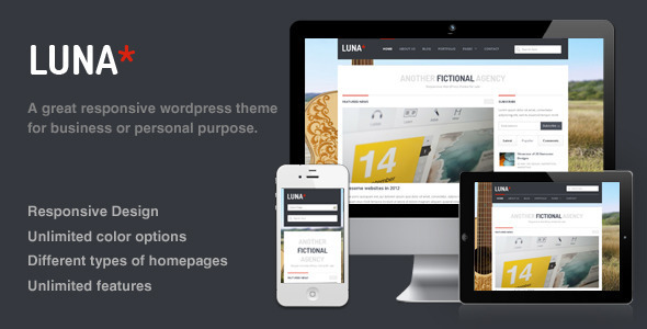
If you are looking for an example, you are actually looking at it! AsepOnde.com is using a responsive website design – this article looks awesome whether you view it on your laptop or smartphone (we are using EngineThemes’ Luna – thanks for the great design, guys!)
Sure, there are websites serving 2 different layouts: For mobile and non-mobile, but nothing can beat the flexibility of a responsive website design. In doubt? Just check out these responsive website designs (for WordPress) to see what uber-creative template designers can offer you.
Why go responsive?
One of my websites is a good example: Previously using an app to cater mobile users, it is now using a responsive design. The results are stunning: Previously getting less than 5 percent of traffic via its less-than-stellar mobile app, it is now getting more than 20 percent of mobile traffic, and it’s growing rapidly, taking over non-mobile traffic slowly but surely.
Just a note: Nothing wrong with a mobile app; it is great, but users need to install it first. Unless what you offer in your mobile app is unique compared to what’s on your websites, it’s not an ideal choice. With responsive design, users can browse your website just like they normally would – no app installation required.
Mobile traffic remains untapped!
If you browse the web, you’ll learn that mobile technology is a goldmine – just like what I mentioned earlier. Today, mobile traffic remains untapped – the potential is huge: People are using everything-mobile more than ever. Your competitors might not even think about using mobile-friendly version of their online business’ websites! Just do a little research: Visit your competitors’ websites from your smartphone or tablet: If they don’t look right, then the competitive edge is yours! If your competitors have done it, then you need to jump into the bandwagon, or else you will be left in the dust.
With that being said, it’s best for you and I to enter the mobile market early – and to me, it starts with overhauling my sites to be mobile-friendly via responsive front-end design.
So, how about you? Have you focused on mobile traffic? If so, please share your tips with us on the comment section below.
Ivan Widjaya
Tapping on mobile traffic
Post cover image by Jason Weaver / Flickr


Comments